Color Me Impressed! 2018’s Most Popular Interior Paint Colors
Every year Pantone comes out with their colors of the year, but they do it to encompass the feel of the year ahead – not what will look best in your home.
Interior paint is a tricky thing to balance. The perfect color can elude you while you’re under those bright lights at a home improvement store.
Get some inspiration before you go with our color picks.
River Rapids
You know what color makes everyone glow, no matter their complexion or preferences? Colors reminiscent of the sea! This seafoam green with a hint of grass fits both categories.
Sherwin Williams hit this color out of the park with it’s muted beauty. It’s neither too green, nor too blue – they balanced it to make the color a perfect neutral.
The feel this color gives to a room is relaxing and fresh. The sunlight plays nicely with the yellow tones in the green, without washing it out.
Talk to someone like a professional from Fitzpatrick Painting to find the perfect spot in your home.
Pair with neutrals and other earth tones, like classed up wicker and light woods. A natural fiber rug will set off the whole thing nicely.
Honeycomb
What are we more concerned about right now than the perfect color? Saving the bees! This is your reminder that we wouldn’t have wine or avocados without them,
What does that have to do with paint? Well, Sherwin Williams is keeping the bees on our mind with their shade honeycomb.
It’s hard to do yellow right in a home, we’ll admit. It can feel impossible to find the right shade that balances warmth and brightness.
This orangey and almost terracotta yellow is the perfect blend. Use it as an accent color in a room with cool colors to warm up the space.
Caliente
Speaking of colors that are hard to balance in a home – we have this bright red. It’s easy to go wrong with red. Too much of a blue tone and it looks cheap, too burgundy and it looks depressing.
This warm orangey-red doesn’t have either of those issues. Try it on one wall of your home and leave the decor around it sparse.
Have some vintage wood floors in your home? This color is an exciting way to dress up a room, without taking away from the aged beauty.
Heart Wood
Are you ready for a paint tone that you’re not expecting? Enter the neutral but pinky-purple tone of heartwood!
It’s almost a dark mauve, but there’s not a perfect way to describe it. It’s like the lilac bedroom of your child dressed up and gone off to NYC.
It pairs great with anything – except we’d stay away from dark tones. Let the light play off the purple with a classic white fur rug and some bohemian feeling linens.
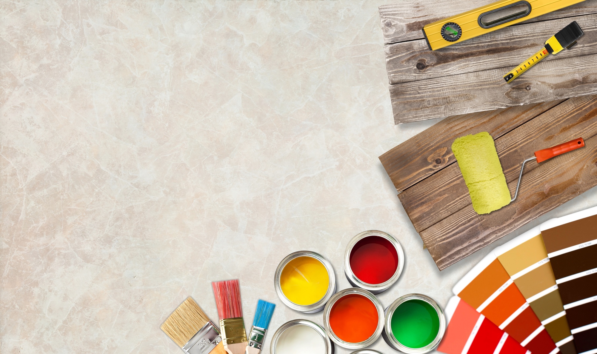
Choosing Interior Paint
You know what makes any color look bad? When you don’t paint it right. Painting with interior paint is a skill and not everyone is blessed with it.
The best way is to let a professional do the bulk of the work. Till then, take a gander around our other homeowner pages.